Krafty
A theme which makes your Typora feel like you’re writing on a Kraft notebook.
Images
What kind of Kraft notebook isn’t plastered all over with instant photos? Not this one, that’s for sure. Images in Krafty are styled with a Polaroid-esque look; a white border, space for labels at the bottom, subtly off-kilter… For an example of how images look, check out the background of this page courtesy of Jill Burrow via Pexels (thank you!):

Code
Code blocks have a white background to stand out against the off-white page, as well as plenty of space around:
/* Here's the code, if you're curious! */
pre, #write .CodeMirror {  background-color: white;  font-family: var(--mono);  padding: 5mm;  margin: 5mm 0;  border: none !important;}
In code view, you also have a line under each line of text. Super helpful to see how many line breaks you’ve used!
Tables
Tables have headers formatted like page headers and cells with a thick white border on the bottom.
| Part of the table | Style | Font |
|---|---|---|
| Header | White background | Roboto Slab |
| Cell | No background, but white bottom border | Outfit |
Fonts
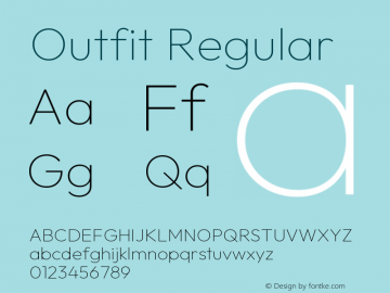
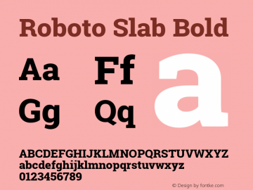
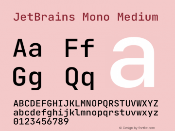
Krafty uses free fonts from Google Fonts, getting them direct from their website, so you don’t need to have them installed! If you’re interested, the three font families used are:
Outfit (for most text)

Roboto Slab (for headings)

JetBrains Mono (for code)

So… This is in Typora?
Yep! No extra HTML added, just the standard Typora parsed MarkDown output. The fancy graphics are all SVG backgrounds applied to the :before and :after tags of the main writing area.